The client
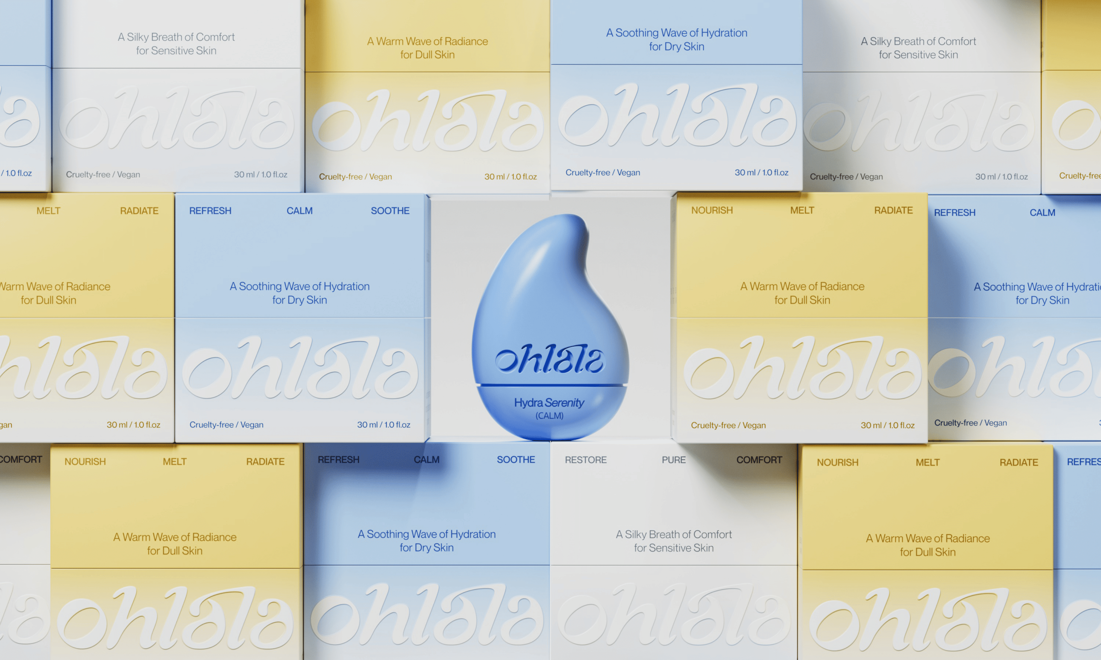
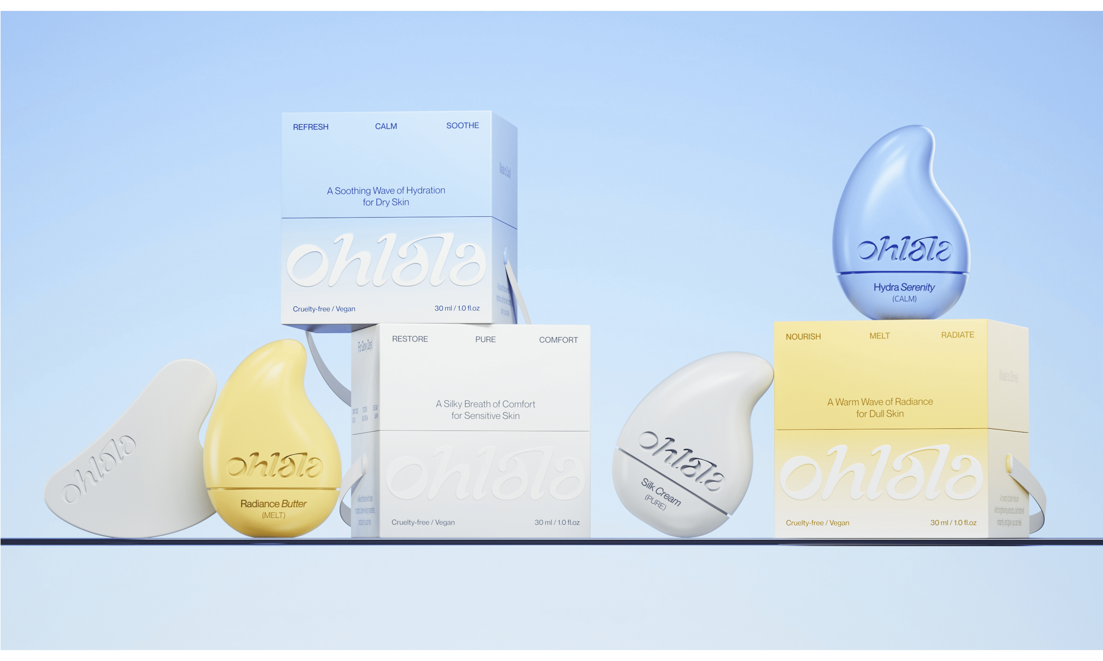
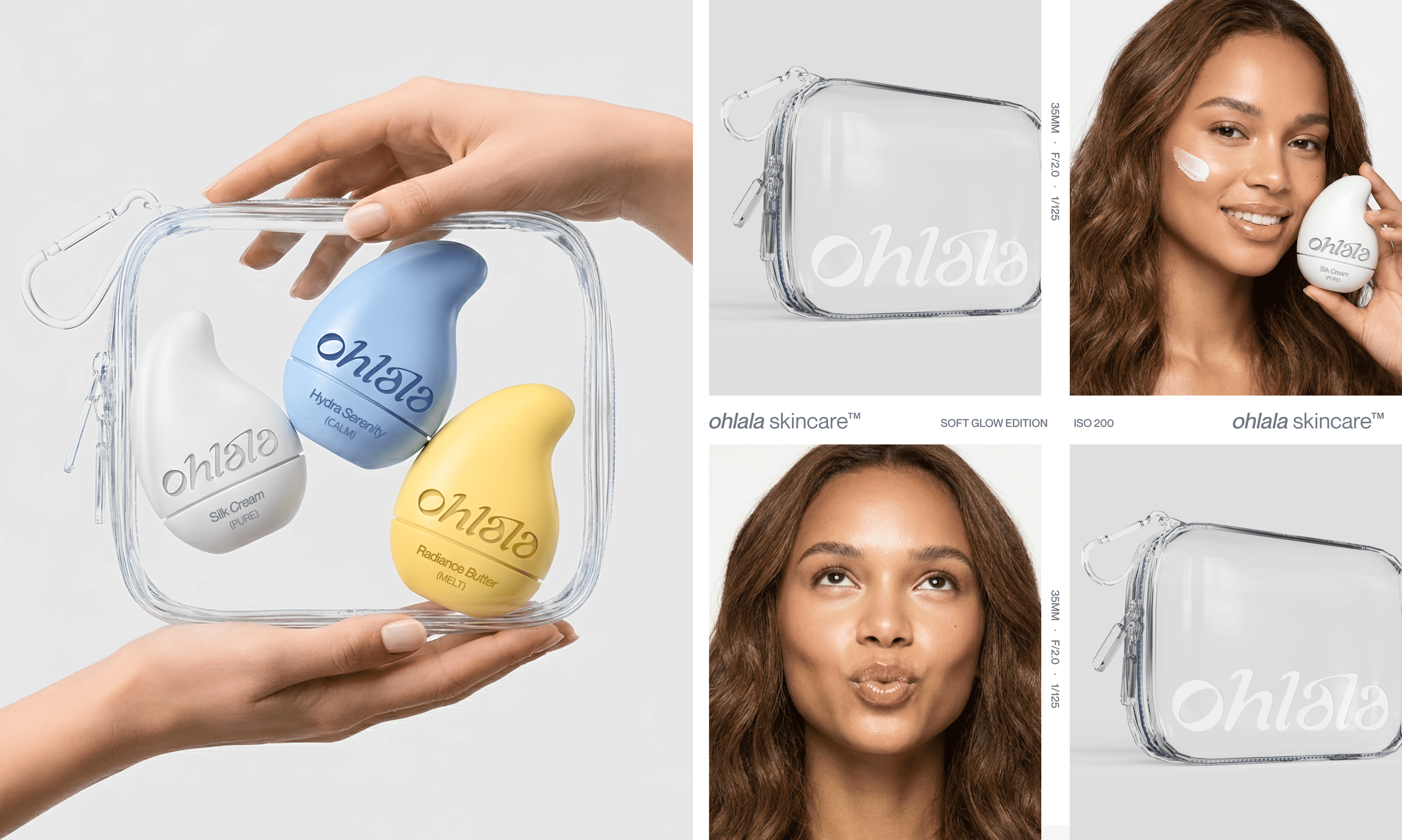
OHLA LA is a skincare brand inspired by everyday rituals and small pauses within the day.Built around care that feels light, tactile, and intuitive - more about sensation than explanation.A brand where skincare becomes a moment: calm, personal, and quietly joyful.
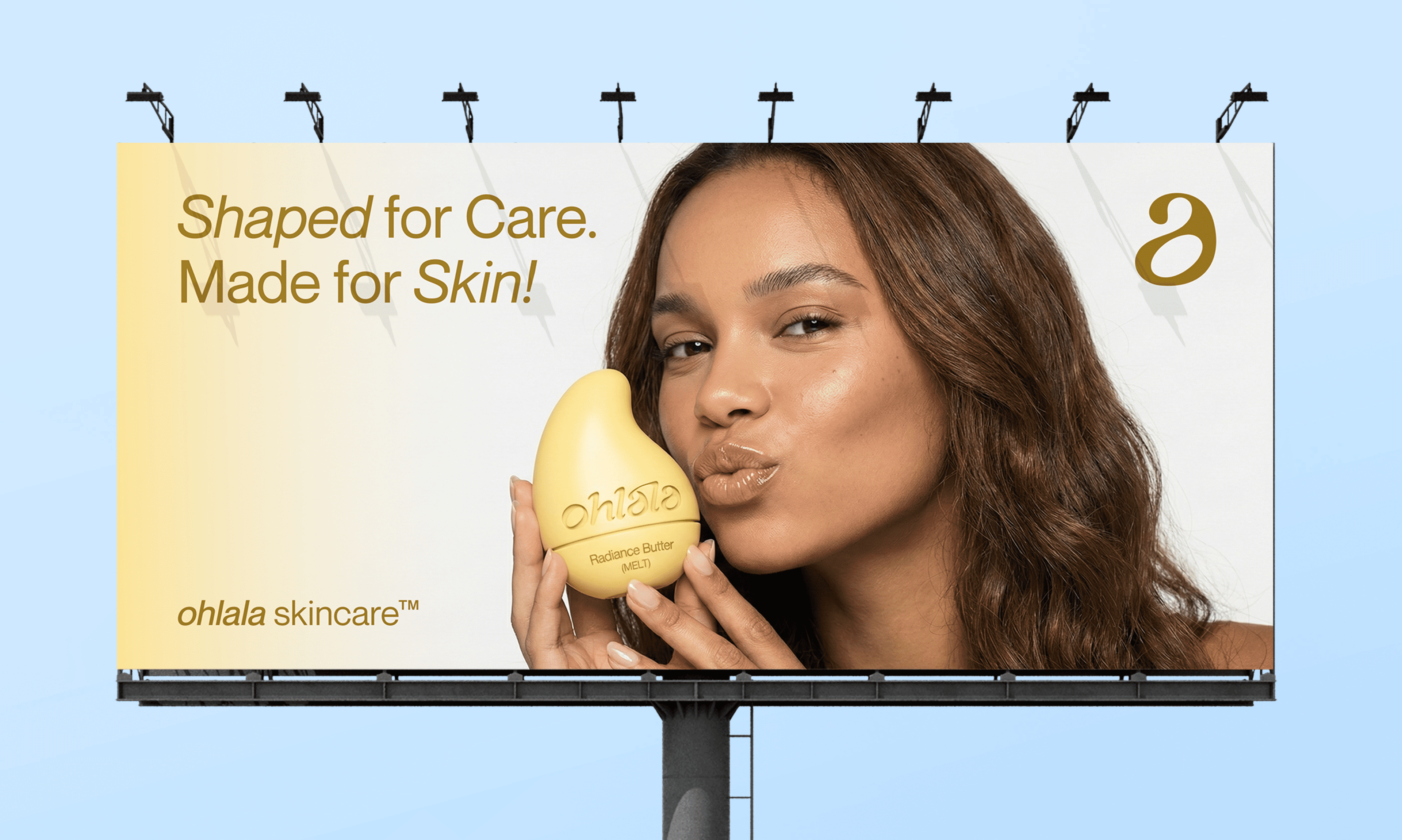
Challenge
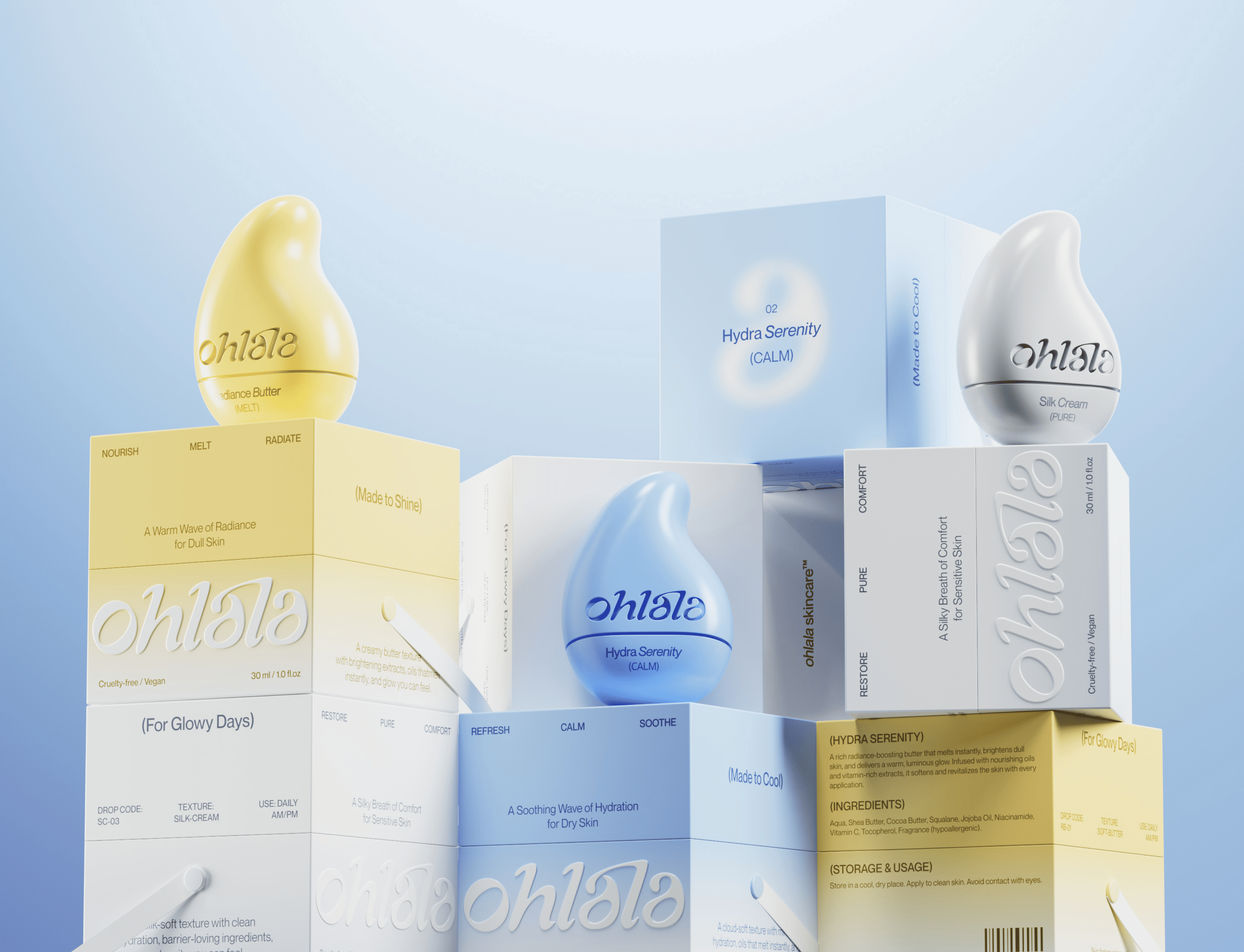
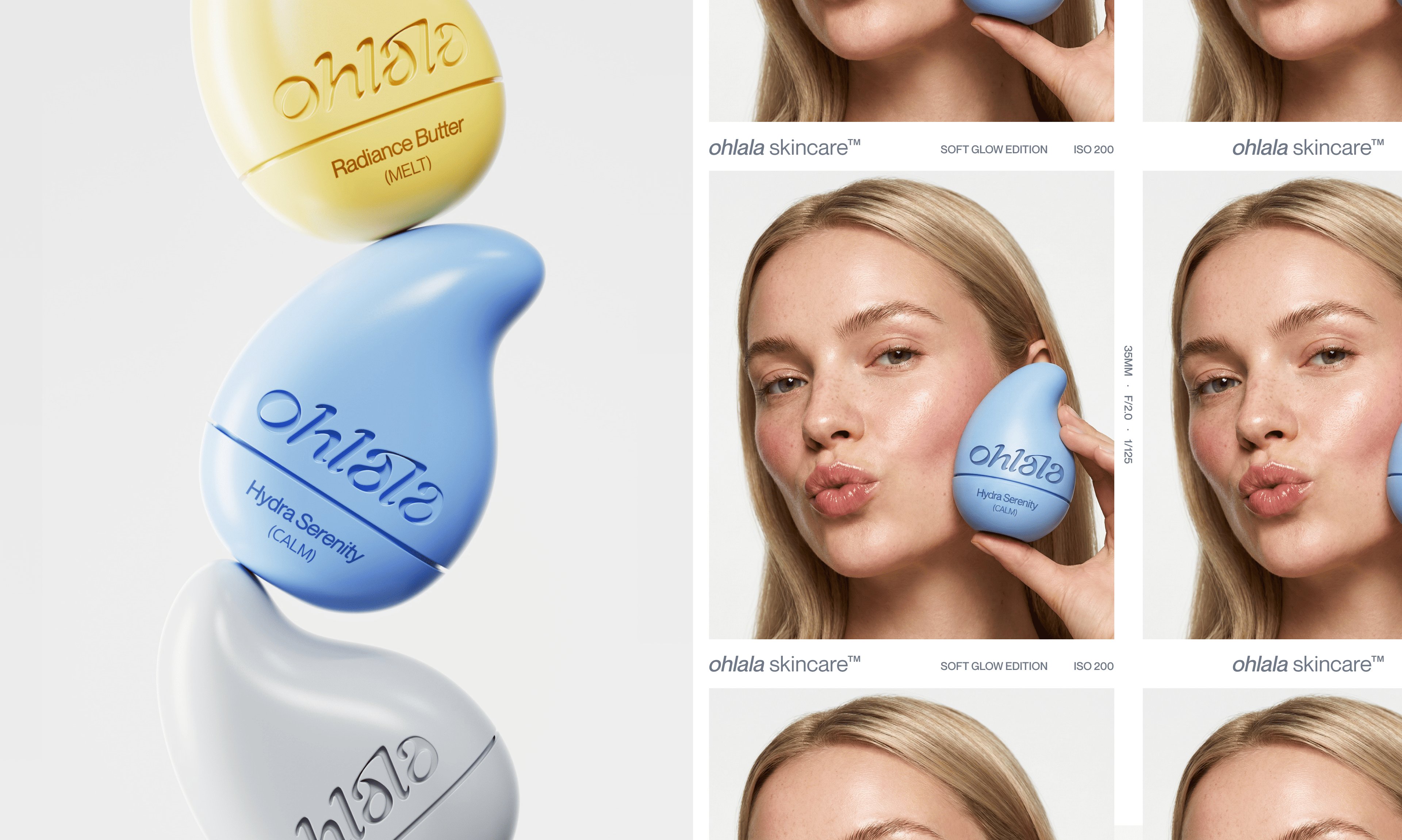
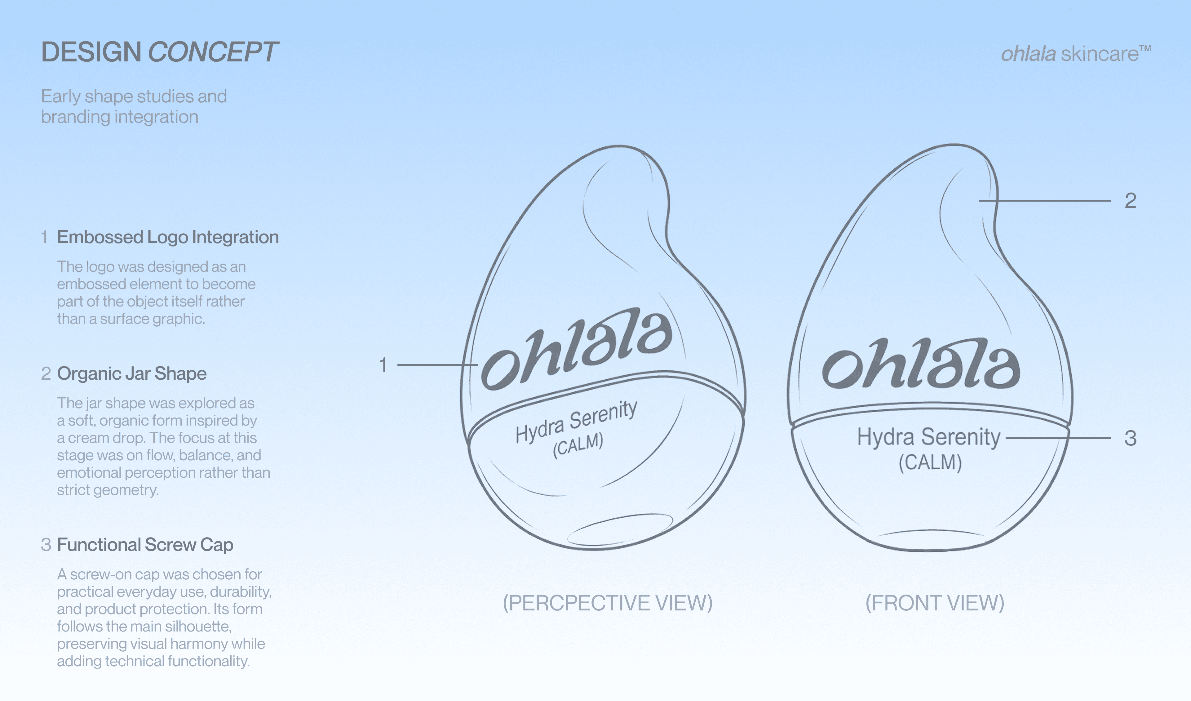
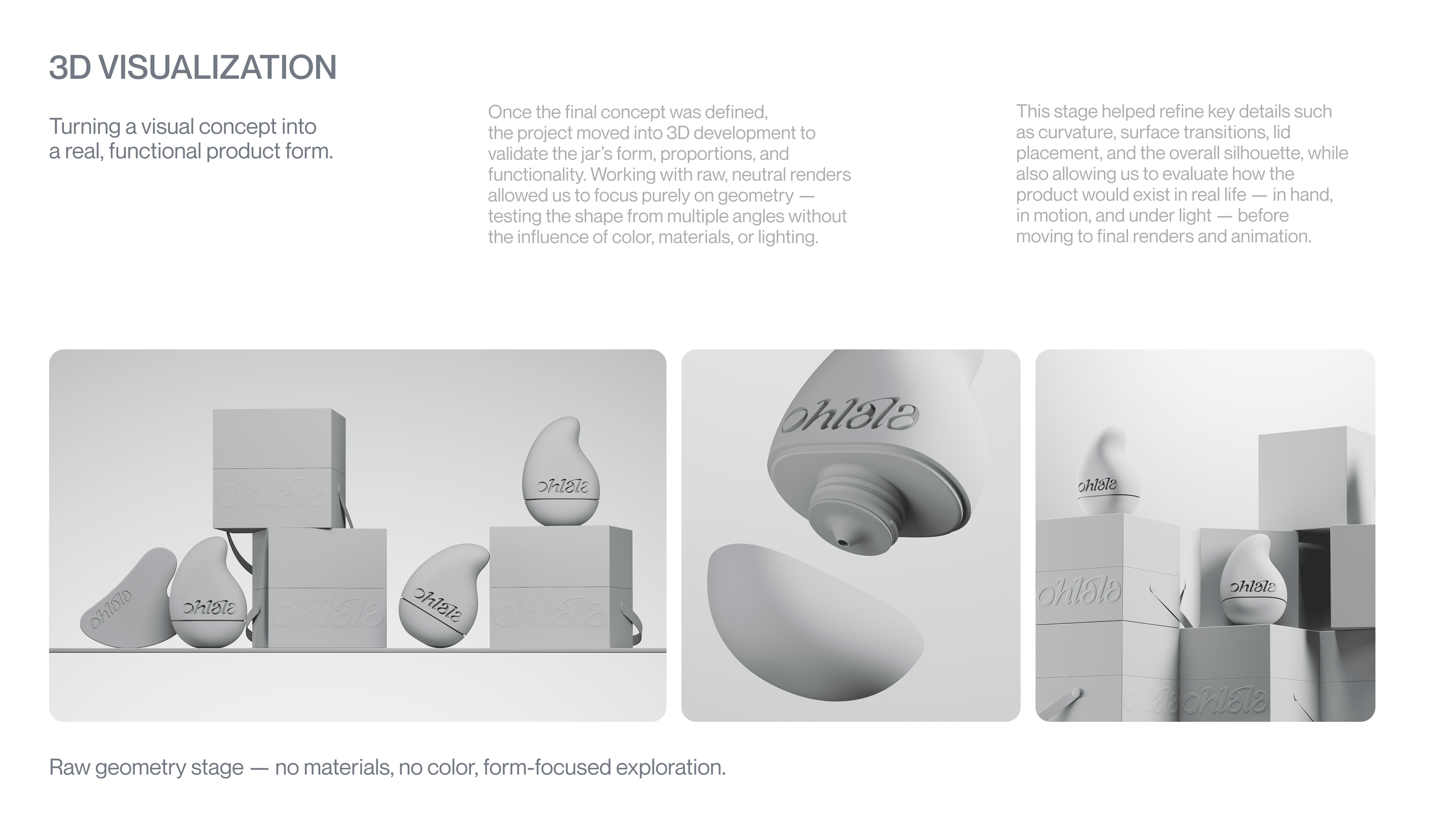
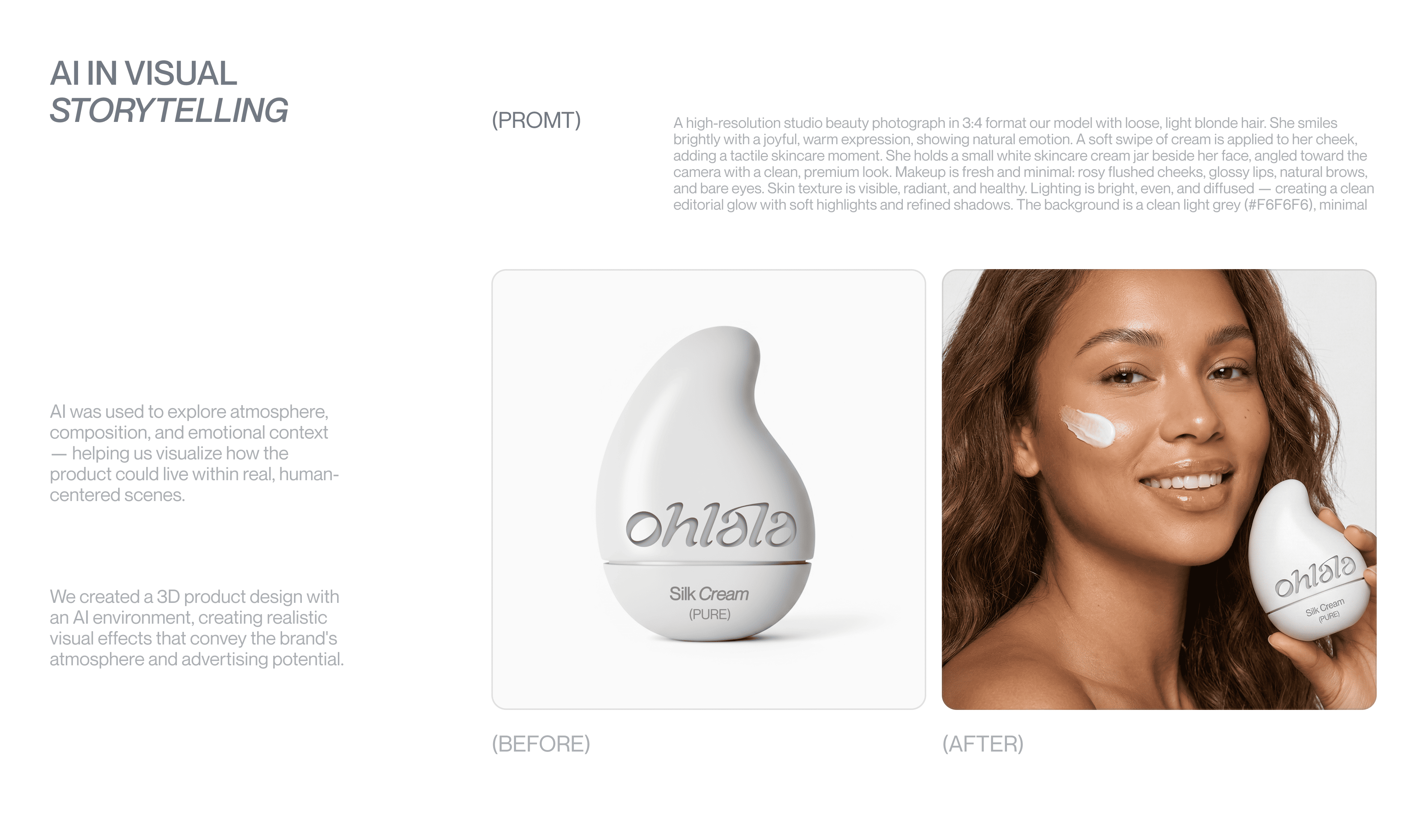
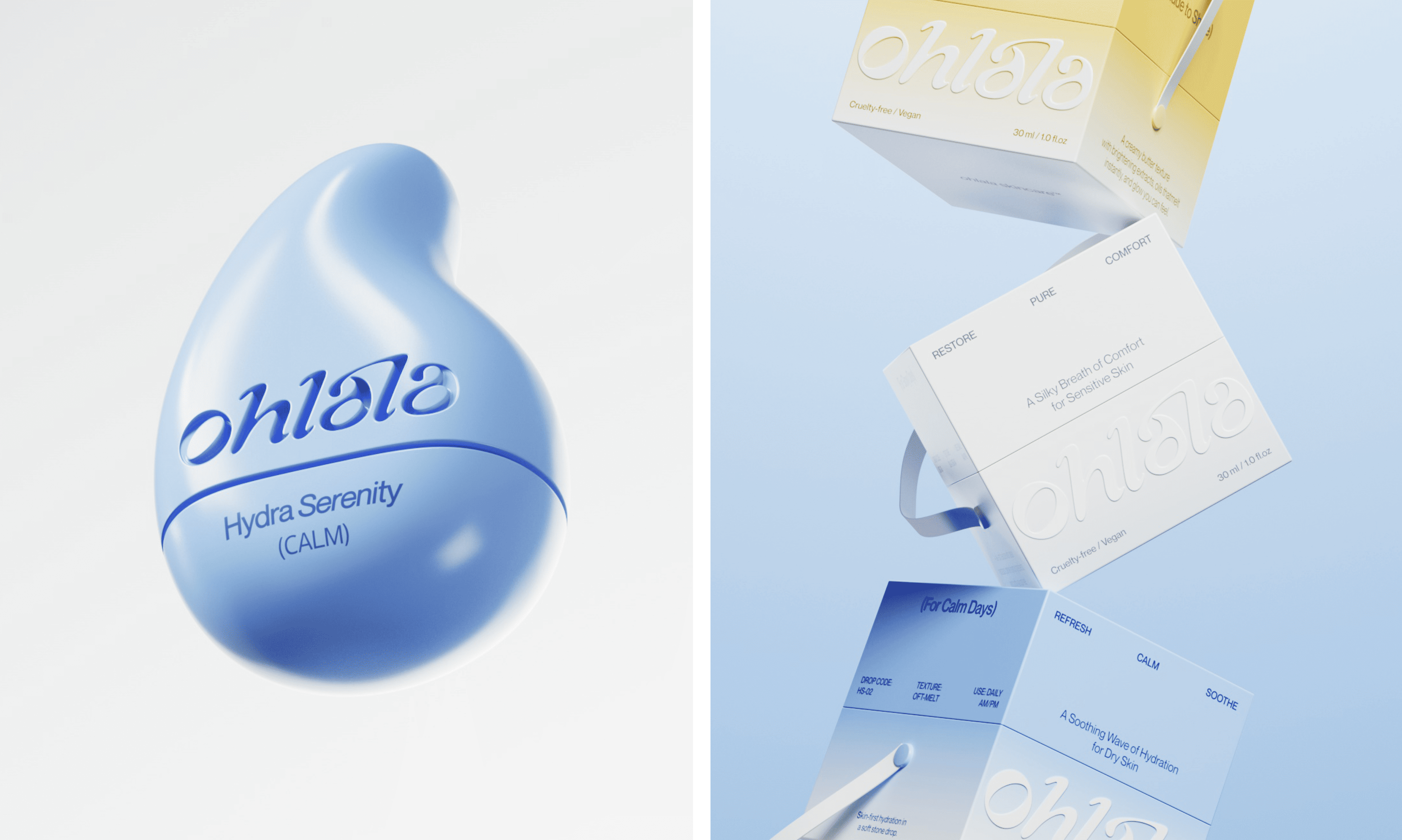
The task was to design a skincare brand that feels clean and playful at the same time - without leaning into clichésof either direction. The identity needed to stand out through form rather than graphics alone. A non-standard jarshape, a distinctive box construction, and a logotype that visually reflects fluidity and care. We aimed to introducesomething new into the skincare design space: a product that feels minimal and precise at first glance, but revealscharacter, tactility, and curiosity through its physical design.
Solution
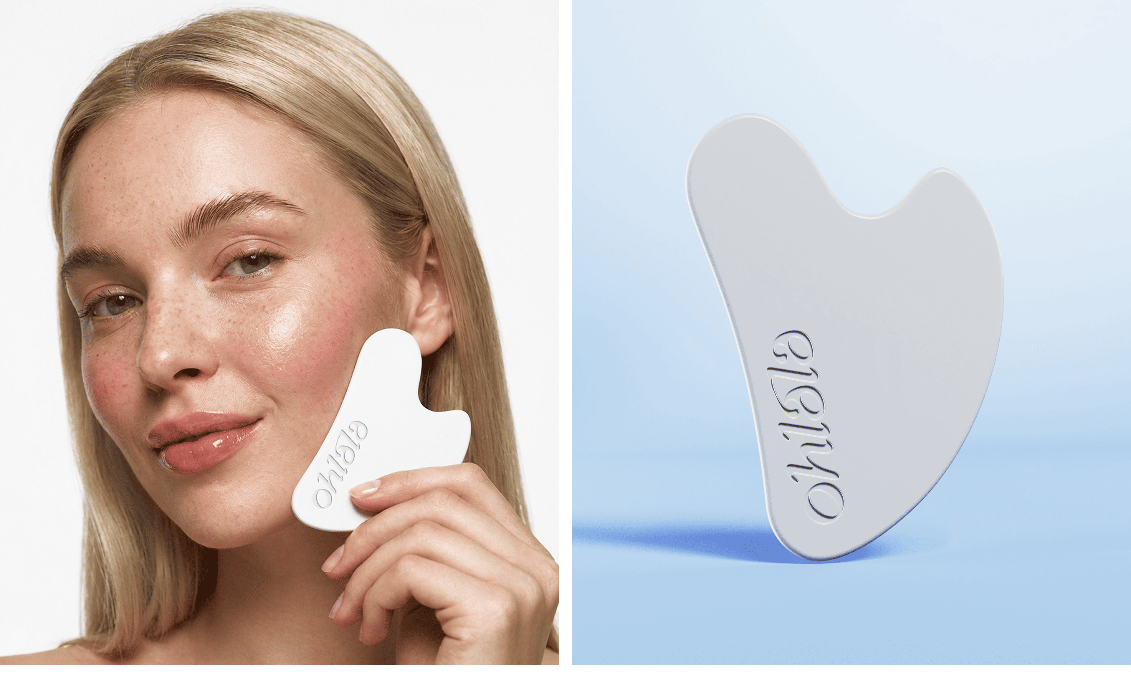
We designed the brand from the shape first. The jar became a soft, sculptural form - rounded, fluid, almost like adrop in motion. The logotype echoes this movement, flowing naturally and reinforcing the feeling of softness andcare. The packaging continues the idea: clean in structure, playful in detail. Subtle curves, light contrasts, and abalance of white, cool blue, and warm yellow create clarity without rigidity.